01/ smart city
logos & branding
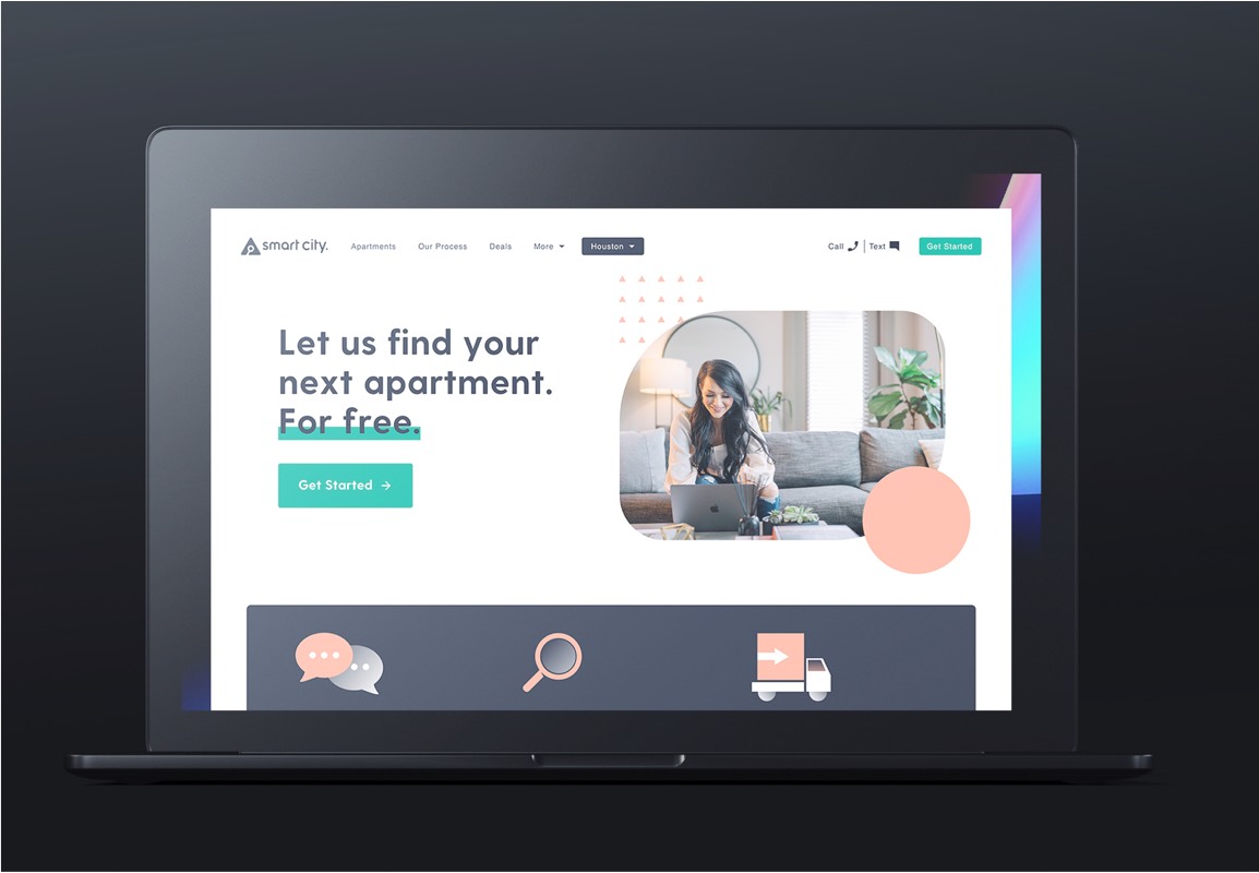
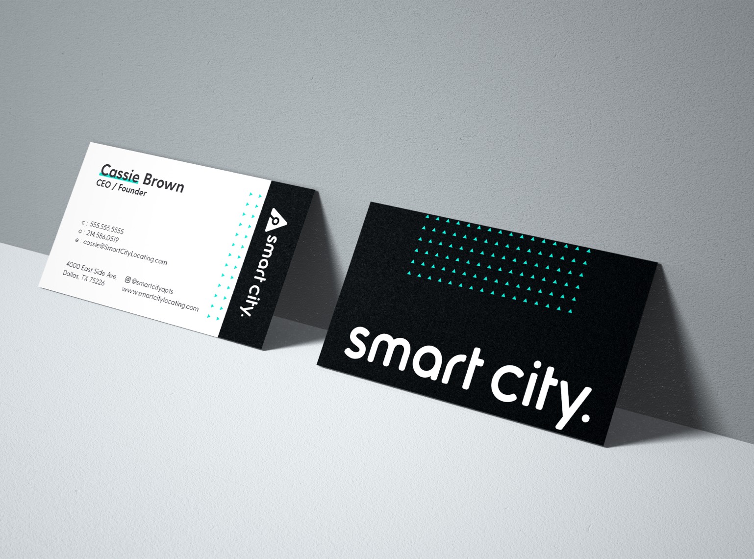
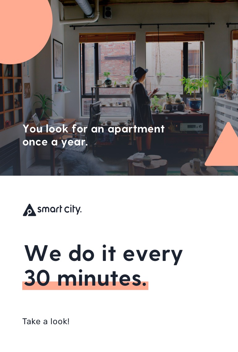
After working at Smart City for 18 months with a focus in UX and a custom software solution, it was time to take our dated brand and creative elements to the next level. A week in the mountains brainstorming our new website ended with this one traingle idea drawn on a mirror in the living room that stuck with the entire team. The idea of what we called the 'Apartment Triangle' stuck with all of us and helped to simplify our look and feel while being the foundation for a complete brand overhaul. The request of the brand followed with the idea of staying simple but interesting. Usage of basic shapes, soft colors, and a bit of depth helped us take our voice and imagery to a more trustworthy place. This brand continues to be my favorite project of all time. More on the UX and web design work can be found here.

